5.31.2005
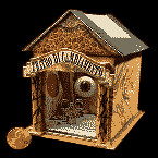 When I was a kid, my grandfather used to take me to the Museum of Natural History in Philadelphia to see the dioramas of animals in their habitats. I think I've always had a soft spot for them ever since, and would love to do a diorama lesson again soon (if I can figure out the best way to include it in a video curriculum). Mars Tokyo's Teeny Theaters would be one of the examples that I would use for a this project. These minature theaters are complete with curtains and suggest different themes and stories.
Of course, I'd also show them Joseph Cornell, because, well, how could I not?
Here's the website of Chase Studios, a company that makes dioramas for museums... just in case your students love dioramas so much that they want to make a career of it...
Tags: Sculpture
5.30.2005
An Excuisite Corpse (The Website) takes the idea in a new direction. Artists connected by a love of design (and the internet) collaborate on projects. The directions contain 90% of your lesson plan right there! Students could pass on designs (if you have networked computers) or get up and move to a new computer at timed intervals.
Tags: Collaborative, Digital Art, Photoshop
5.28.2005
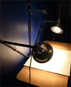 If one of your art teaching responsibilites (or things you do out of the kindness of your heart) includes helping your students take slides of their work for a portfolio, this website shows you how to make your own photo studio for less than $100. An especially nice idea if your school doesn't want to shell out the $700 plus that these things usually cost.
The Revolution would also like to officially recognize and welcome our newest member; welcome Kim! Our ranks our growing (with a disproportionate number of Kims)...
Tags: Photography
5.27.2005

My advanced video students recently finished a project in rotoscoping, which was a highly labor intensive but ultimately rewarding experience for all of us. If you've access to computers and a camera, it is a great project - especially for those students who are invaribly finished days early. Because it is so labor intensive, it's better to come back to it every once in a while. A great example of rotoscoping is the movie "Waking Life" by Richard Linklater, which was filmed on a digital camera and then each frame was digitally painted. The website for Waking Life has a great little explanitory video.
And here are some really interesting outside the box examples of rotoscoping:
Artist Krišs Salmanis created a rotoscope by videotaping himself walking, transferring his stills into stencils, taking pictures of his stencils around his town, and finally creating an animation of his graffiti in sequence.
Artist Gregory Barsamian makes rotoscoped sculptures!
Caution: There are scenes in "Waking Life" that might be inappropriate for your class, Salmanis' video involves graffiti on public property, and one of Barsamian's sculptures may be unsuitable for younger viewers. Once again, use these examples at your own discretion.
5.26.2005

An interesting ongoing project encouraging student involvement is the 100 People: A World Portrait. The video also includes a visit at the Friends School in Manhattan.
It definitely puts things in perspective when, out of any given 100 people representing the global community, only 1 would be college educated.
Tags: Collaborative
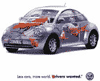
Are your students living in a media-oversaturated environment? Wow, so are mine! However, they are also very receptive to an examination and critique of different forms of advertising, and an investigation of how it attempts to manipulate the viewer. Our "anticommercial" project attempts to turn the consumer message on itself. One inspiration for this project are the print ads from adbusters a magazine and website that critiques media culture. Their "spoof ad" gallery is here.
OK... I have to come clean. The real reason I posted this today is because there's a great new "anticommercial" by the Organic Trade Association that deals with two of my favorite subjects: food and Star Wars. Apologies, I'm still caught up in the "Episode III" excitement....
5.25.2005

What good would a revolution be without a little subversion? Rather than throw away doodles and drawings made during standardized testing, why not send them to Non-Standard, a wesbite that is collecting test-stress doodles as affirmations of individuality in the face of the all-conforming standardized tests. No art left behind!
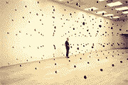
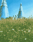 If you need inspiration from artists doing unusual things combining science, art, math, and the environment, then check out The Green Musuem. There's also Greening Gotham in New York which proposes the idea of "greening" the rooftops of city buildings. And then there's the artist Tom Shannon who I met recently. His work deals with interplanatary relationships, as well as magnetic fields, balance, and counter-balance.
Tags: Activism, Environmental Art
5.24.2005
Tags: Collage
5.23.2005
Tags: Printing
5.22.2005
![]()
The Dia:Beacon in "upstate" New York is a great place to visit. The work is a collection of contemporary art from 1960s on, including the beginning of some installation art. Of course, there are many artists left out, but it's great to be in a huge space devoted to just a few of the critical artists of that period. I was inspired by this to do a unit on installation and environmental art that went over well with many of my h.s. kids. (This can work for m.s. kids too!).
An example of some current installation art can be seen at an exhibit in Philadelphia at the Eastern Penitentiary.
5.21.2005

The Getty Center also has a great deal of online resources for art educators. They have an education center, artist exchange bulletin boards and lesson plan ideas all online. The site used to be part of ArtEdNet. They are making the move because "Moving ArtsEdNet resources not only provides a central location for you to access the Getty's educational resources, but also offers search functions to help you locate what you need quickly and easily."
Tags: Lesson Plans, Pedagogy
 This site offers a rather comprehensive examination of the Sistine Chapel. You can click on any part of the ceiling for a high-resolution view and detailed description of the various scenes.
Tags: Art History
5.20.2005
 One of my current projects requires students to investigate an art movement and then imagine what a video made in that style would look like. Part of the inspiration for this was Salvador Dali's Destino , but unfortunatly, I can't seem to find a full copy of that anywhere (although it is on display at The Philadelphia Museum of Art). However, another good example for this lesson would be Ode to Summer by Ron Hui. Summer is made with 3D computer animation, but the concept is the same.
Also, welcome to the newest member of the revolution. Rey Rey is moving to Taiwan to teach art and open up our new Asian division (the Taro revolution?).
Tags: Animation, Art History, Surrealism, Video
5.19.2005
 Another indispensable resource for the art educator is the Art 21 series from PBS. The site features the biographies of contemporary artists, as well as a lesson library grouped according to themes such as identity, consumption, spirituality and humor.
Tags: Lesson Plans
5.18.2005

The University of Illinois at Chicago has created an indispensable resource for art teachers. The Spiral Art Education website includes great lessons that came out of their art education program. I have used and adapted quite a few lessons from this website, which was first brought to my attention by Kim - the newest member in our growing cause! Welcome Kim!
Tags: Lesson Plans
5.17.2005
Possible project:
Create illustrations from your favorite book (obvious but interesting).
-or-
Choose a few lines in a given book and focus on the visual image of the line over its context in the book.
Tags: Drawing, Illustration
5.16.2005
 Planning a lesson in mosaics? These tile mosaics of Alfred Hitchcock film scenes might provide some unique examples.
Tags: Crafts
5.14.2005
Tags: Comics, Lesson Plans
The Museum of the Moving Image is an excellent resource for any curriculum that involves film or video, especially if you're teaching in or around NYC. However, their online exhibition is a great resource no matter where you are - as long as a computer is nearby. Especially informative is Shutters, Sprockets, and Tubes, which consists of six online interactive tutorials explaining the technology behind movies and television.
5.13.2005
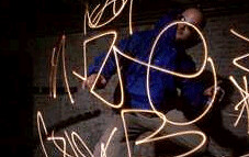
This would be an interesting project to try if you can get 20 or so cameras and a large dark room.
A group of Dutch artists use long-exposure photography and the Matrix "Bullet Time" muliple camera technique to create unique videos of graffiti and light.
Tags: Animation, Digital Art, Photography
In honor of Mike joining the revolution (welcome comrade!) today we have for you a photography post (and a very cool one, indeed). The Dirkon Paper Camera is a Czech designed pinhole camera that you can print out on cardstock and build yourself. It sounds a little advanced (I haven't tried it yet myself) but it sounds great for a high school photography class or lesson. 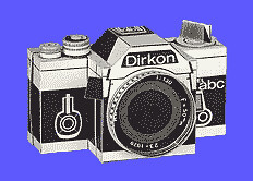
Tags: Crafts, Photography
5.12.2005
Tags: Art History, Collaborative, MoMA, Museums, Podcasts
5.11.2005
Greetings.
Welcome to the Carrot Revolution! Our aim is to liberate art in the classroom through an exchange of new ideas, lessons, and inspirational works! We fight against the tyranny of the ordinary! We post a lot of interesting random art stuff we find on the web! Join the fight! It is never to late to conquer the status quo!
"The day is coming when a single carrot, freshly observed, will set off a revolution."
-Paul Cezanne

